
Brighton Seaside
The recent London To Brighton exhibition has just concluded, and as a sequel, I thought I would highlight some of the Brighton seaside-inspired works that we have here at the gallery, in an effort to maybe beg the sun to stay with us a little longer, and celebrate the lovely summer we have had this year.

Rik Ward : Brighton Dream
We were ecstatic to have Rik Ward and Marc Gooderham as two new artists on board, and their exhibition went by as an absolute dream and brought a lot of interest.
Comparing London to Brighton, through both photography and painting forced us to look at the differences and similarities both of these two mediums as well as these two places, and interesting ideas cropped up. Easily the most interesting aspect was the abundance of street art and graffiti work in Brighton scenes, and the lack thereof in London and I loved discussing this in this video here.

Marc Gooderham : Fall to Ruin
In Rik's compositions, his background as a painter becomes apparent in the way his scenes are set up. He chooses photography now as he enjoys turning this medium on its head – and instead of editing out (what is a mistake, what is ugly), which you tend to do in classic photography – he enjoys putting this forth, in different layers, and we discover textures or secluded, industrial-looking areas in our environments, layered on top of each other. Also, this is how and why graffiti also appears in his work.
For Marc, the effortless way in which he introduces graffiti in his work is outstanding. It is very difficult to paint signs and logos, as the way you treat a logo in an otherwise painterly scene might give away some of the magic and the tricks behind "making it look real" for the eye. Marc integrates street art and graffiti into his work seamlessly, reinforcing the illusion of the places he is representing.

Marc Gooderham : Underneath the Arches
Moving forward, I would like to introduce our ceramics that are either inspired by the sea or that imitate it so much so that they may as well have been discovered beneath the waves.

Carys Davies : Pebbles
Carys Davies often finishes her vessels by giving them a smooth and shiny glaze inside and leaving the outside surfaces rough with organic textures – almost maybe like shells. Carys' pebble vessels, however, are not as rough as regular stones, and they end up having the smoothed-over texture of pebbles; the stones that are washed up on the beach and smoothed over by the water.

Paul Wearing : Cylinder
Paul Wearing is inspired by nature and landscapes, and by natural textures on the surfaces of objects. His work is alchemical in nature, as it transforms during the making process in the kiln, and he allows this to happen gracefully. The result mirrors this alchemy in real life, as his vessels appear to have been found at the bottom of the sea, and are revelatory of nature's cycles.
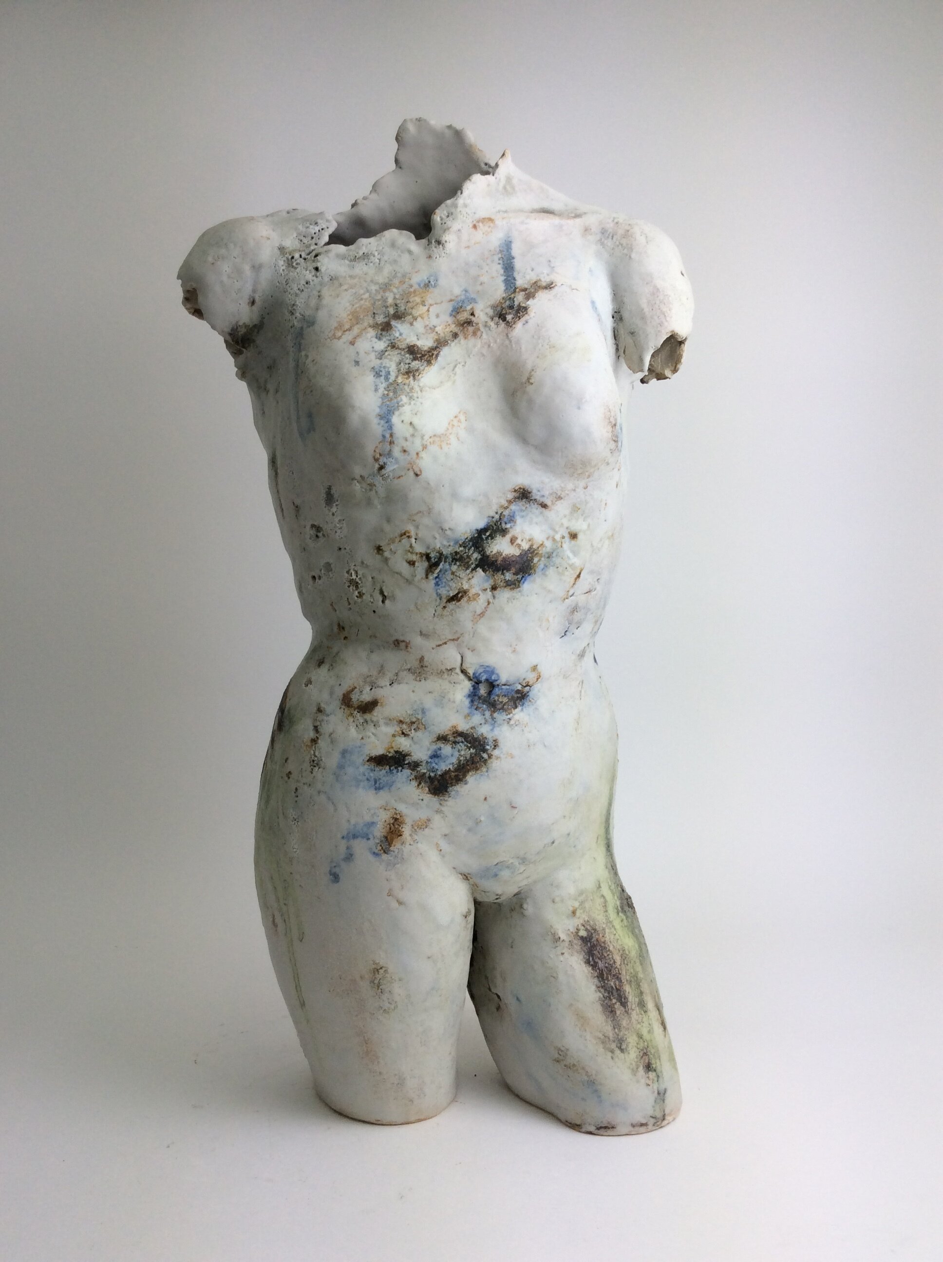
Adela Powell : Landscape Figure III
Adela Powell's landscape figures address similar concerns, as nature, landscapes and the sea inspire her. Her work also explores these eroded surfaces that are mirrored in her making process, which involves several different oxides and glazes to achieve this. The result is sculptures that seem long lost at sea evocative of natural, long occurring processes that happen with or without our will.

Andy Waite : Drifting on an Empty Sea
Andy Waite is one of our painters who is similarly inspired by landscape and nature. Regularly, in his paintings, you can make out skies, and far away horizons of hills. However rarely the one above, 'Drifting on an Empty Sea', you can make out the horizon to the sea. Andy's brushstrokes are a mystery to us. How is it that the viewer can clearly differentiate the sea from his usual skies? Yet this is the sense you instantly feel. It is clear then that his process of long walks and poetry heavily influence these paintings, and they become imbued with the spirit of the places Andy travels, and then relates to us, beyond the technicalities of painting.

Clare Wood : Listen to the Wind
Clare' Wood’s abstract landscapes are her expression of ‘place', gathered from journeys around the craggy Cornish coast. Her paintings also start by her walking in the landscape and, similarly to Andy Waite, you can play the game of figuring out what they represent. Although Clare's abstraction goes even further to where you maybe wouldn't be able to guess they are landscapes, unless you knew, or unless you looked at them from the right angle and in the right light, and suddenly had this realization.
Her new series of works at the gallery involves a lot of similar colours to "Sea Green", these lovely shades of turquoise and copper foil that work perfectly to remind us of the lovely summer we have had along the Brighton coast.